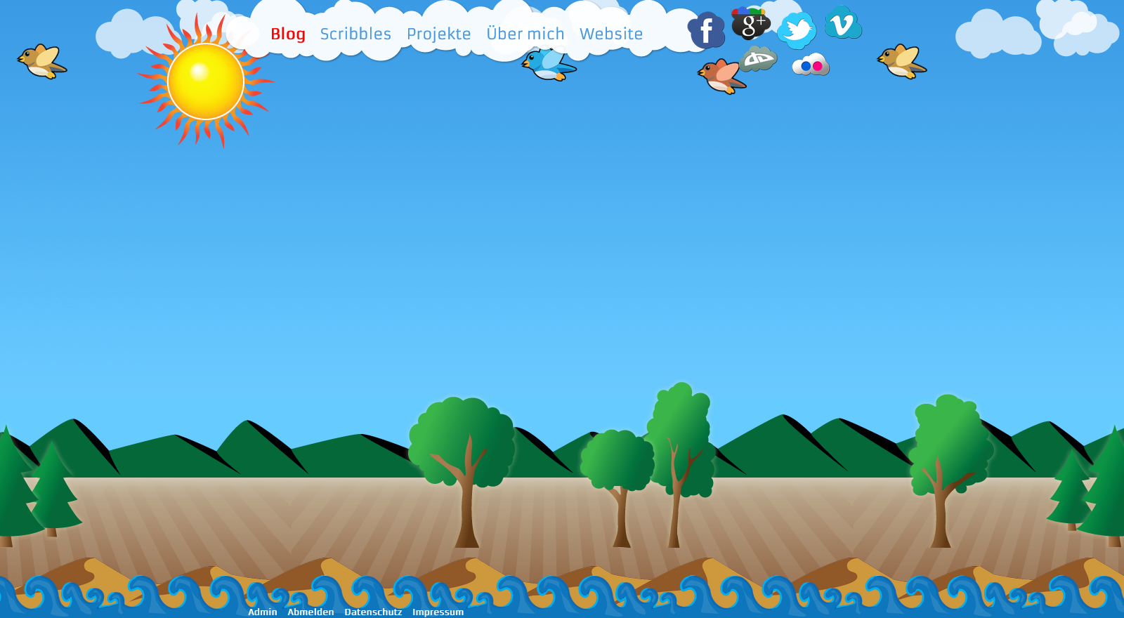
 Das neue Design da! Bunt, gar nicht edel oder schlicht, ein Gegensatz zum Apple-Look. Dafür ist es individuell.
Was habe ich mir dabei gedacht? Zuerst einmal ist es ein durchgängiges Design. Bisher hatte ich mir immer Elemente und Ideen aus den verschiedensten Ecken geholt, was dann irgendwann nicht mehr zusammen gepasst hat. Weiter ist es ein Design, das in eine komplett andere Richtung geht als alles was ich bisher gemacht habe. Mit Vektorgrafik hatte ich bisher noch nicht viel am Hut.
The new design is done! It’s colourful, absolutely not plain or classy, but a contrast to the Apple-look and very individual.
What were my motivations? For one thing it’s a complete design where all the parts fit together. All my old designs were patchwork, with ideas and elements from so many different areas that they just didn’t fit together. Furthermore, this design has a completely different style than anything I’ve done before. Vector graphics just wasn’t my thing. It still isn’t, but now I’m much more comfortable around Illustrator than a few weeks before.
Die Erstellung der Elemente hat mir dann aber doch richtig Spaß gemacht. Und ich habe für die Zukunft jetzt zum Beispiel über 30 Vektorgrafik-Wolken zur Verfügung. Ganz einfach war es nicht, denn wie sieht denn eine typische Wolke aus? Hat sie oben mehr “Wölkchen” oder unten? Und wie sieht ein typischer Baum aus? Tannen sind ja leicht, aber Laubbäume… Hier hat mir dann die Erfahrung aus dem Studium geholfen – im ersten Semester mussten wir stundenlang Vektortexturen aus Fotos erstellen. Das selbe Prinzip konnte ich auf die Bäume und anderen Elemente anwenden.
Die Sozialen Netzwerke sind in Wolken verpackt worden, die Kommentarangaben oben rechts in den Posts ebenso.
Die Like-Buttons muss ich noch umgestalten, aber auch dafür habe ich noch genügend Wolkenelemente zur Verfügung.
Ach ja: eigentlich orientiert sich das Theme am neuen Design meiner Webseite, welche allerdings technisch noch nicht ganz vollendet und daher auch noch nicht online ist. Kommt demnächst.
Kommentare sind erwünscht. Verbessern kann man immer etwas.
Creating the different elements was quite a lot of fun.There was lots of experimenting involved but I now have over 30 vector clouds ready for future use. Creating those wasn’t as easy as it sounds. How does a typical cloud look? Are there more curves on to or at the bottom? Which curves should longer, which wider? An how about a typical tree? It’s easy for firs, but not for broad-leaf trees like oaks and beeches? After some experimenting I noticed that the experience from my first semester course in digital design was very helpful. I had spent hours of creating vector textures from photo templates, always looking for the important characteristics. I then used the same principle for the trees.
The social networks were put into clouds, just as the comment signs in the upper right of each post. I still need to style the like-buttons, but I’m sure I have enough cloud elements left.
Originally this wasn’t a WordPress theme design. It was created for my new website, which still lacks some technical parts and is therefore not online yet. I hope to finish it soon.
Please comment on the design. One can always improve things.
Es ist spannend die Veränderungen deines Blogs zu beobachten.
Wirkt auf mich sehr sympathisch das neue Design ich finde es hat jedoch zu viele Elemente die mich ablenken vom eigentlichen Inhalt.